Provider switcher
Find your provider by its logo and mini usage bar. Tabs remain available while fresh data loads, so a pending probe does not block switching.
USAGESTAT BAR / YOUR DESKTOP COMPANION
Your AI usage, right on your desktop. Keep the numbers you care about visible, look a little closer when you need to, and stay in your flow.
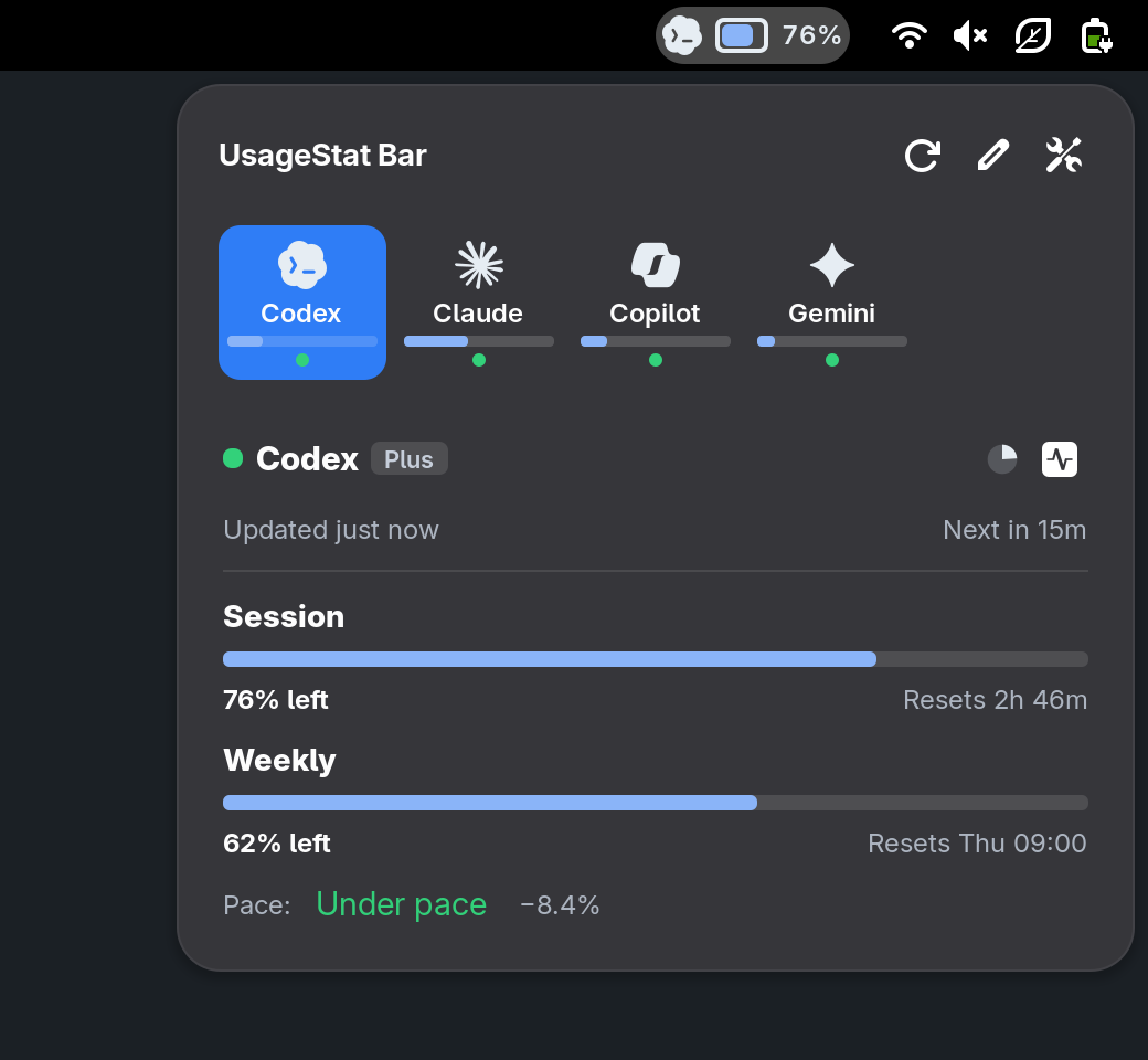
Select a provider in the capture to explore.
Codex. Session: 76% left. Resets 2h 46m. Weekly: 62% left. Resets Thu 09:00.
WINDOWS, MACOS & LINUX. ONE BAR.
Your Windows system tray, macOS menu bar, or Linux desktop panel. Explore the Linux previews for GNOME, KDE Plasma, Cinnamon, MATE, Xfce, LXQt, Budgie, COSMIC, Sway, Hyprland, i3, and bspwm, each with its own styling and chosen background.
| System / desktop | Integration | Get started |
|---|---|---|
| Windows | System tray app | Install |
| macOS | Menu bar app | Install |
| GNOME | Shell extension | Try it |
| KDE Plasma | Plasma 6.4+ widget | Try it |
| Cinnamon | Panel applet | Try it |
| MATE | Panel applet | Try it |
| Xfce | Native panel plugin | Try it |
| LXQt | Status tray | Try it |
| Budgie | System tray | Try it |
| COSMIC | Status area | Try it |
| Sway | Native Waybar widget | Try it |
| Hyprland | Native Waybar widget | Try it |
| i3 | Polybar | Try it |
| bspwm | Polybar | Try it |
Other Linux desktops can use the shared tray integration with a StatusNotifier host. All integrations share the same backend and provider settings.
The latest interaction report checks all 12 integrations. GNOME, Plasma, Cinnamon, MATE, Xfce, LXQt, Sway, Budgie, i3, and bspwm passed their supported checks. Native panel widgets support all four edges; GNOME uses its top panel, and the Polybar profiles use top or bottom placement.
Hyprland still has a repeated-click issue after its popup takes focus. COSMIC’s test session was blocked by a compositor crash and needs a healthy session for full validation. These browser demos use sample data and do not reproduce compositor behavior.
Read the interaction report ↗YOUR PROVIDERS. YOUR STYLE. YOUR RULES.
A quiet logo, a row of useful numbers, or colors that feel at home on your desktop. Change the layout, the details, and the way you read your usage. Open the interactive demo whenever you want to try it for yourself.
JUST ENOUGH INFORMATION.
Build a panel indicator from the components you actually want. Keep one provider in view, or make room for several. Explore layouts captured directly from the extension.

Codex pinned beside Claude, with a logo, two stacked usage meters, and a percentage each.
Captured from the extension with sample data. Configure your own layout in UsageStat Bar preferences.
A LITTLE CLOSER, WHEN YOU NEED IT.
Open the popup to switch providers, inspect individual usage windows, and see the information behind the panel meter.
Find your provider by its logo and mini usage bar. Tabs remain available while fresh data loads, so a pending probe does not block switching.
See session, weekly, and other provider-specific meters. Choose which trackers appear and which usage window drives each provider’s panel indicator.
See when a quota resets, along with when the provider was last refreshed. Choose your preferred reset-time display in preferences.
Keep supported credit, balance, quota, and spend rows visible, or hide the ones you do not need. Available rows follow the provider’s reported data.
Show the backend’s pace information where the provider supports it, indicating usage relative to the expected rate through the quota window.
Refresh data, jump to the active provider’s preferences, or open its usage dashboard and status page when links are available. Scroll within the popup to switch providers.
YOUR DEFINITION OF “GETTING CLOSE.”
Create usage thresholds with a name, percentage used, and color. Turn notifications on for the thresholds that matter to you.
Threshold controls are implemented. The project’s feature checklist still calls for broader validation with real provider data and edge cases.
YOUR ACCOUNTS DON’T ALL LOOK THE SAME.
The bar discovers providers through the backend. Preferences let you organize the installed integrations and add the sources that fit your workflow.
Enable, disable, hide, and drag-reorder providers. Enabled, disabled, plugin, and hidden sections help keep a large provider list manageable.
Create a named provider instance as a separate switcher tab, or group extra sources inside an existing provider tab. Reorder the child sections independently.
Add API tracking as another source when the provider supports API keys, or switch an existing source to the available API mode.
Connect a command that prints a UsageStat-style usage JSON object or array. Give the source a name and remove it later without deleting the built-in provider.
Provider support follows your backend. The bar can only display the data your installed plugins and authenticated sources return. Some provider metadata and newer integrations require a source-build backend.
NATIVE PREFERENCES. PLENTY OF ROOM TO ADJUST.
From individual icons to the way you move between accounts, every setting has a place. Open a category to see what you can change and where to find it in the GNOME preferences. Linux ports share the same provider settings, with separate controls for tray icons.
Appearance → Panel / Top Bar Components
Appearance → Provider Icons / Appearance Colors; Providers → a provider
Behaviour → Data / Popup; Providers → a provider
Appearance → Thresholds
Behaviour → Data / Interaction; Tools → Terminal
Providers
Preference availability follows the selected integration. Each demo uses its desktop’s default appearance, independently of this website’s light/dark setting.
LESS FRICTION WHEN SETTING UP.
Auto-detect the usagestat executable or select a custom path. See the detected version or launch status, and copy the resolved path.
Use automatic plugin discovery or select a folder. Inspect the discovered provider count and surface missing or invalid plugin setup.
Choose an available terminal and launch configuration validation, provider listing, usage, status, cost summaries, JSON/CSV exports, cache clearing, or CLI help.
The extension runs the installed CLI for usage. It does not require the background daemon; the daemon is for the backend dashboard, HTTP API, and T3 bridge.
BUILT IN THE OPEN.
For the GNOME integration, use the development link for local work, compile changed schemas, test in a nested GNOME Shell, and build a submission ZIP with the included helpers.
./dev-link.sh links the working checkout into your extensions directory.glib-compile-schemas schemas rebuilds changed settings schemas../test-nested.sh and the shell helpers support development testing../build.sh assembles the extension ZIP.The Linux ports include native panel widgets, shared GTK preferences, tray integration, and Waybar and Polybar modules. Desktop labs and disposable VM tests cover Linux installation and interaction. Windows uses the system tray, and macOS uses the menu bar.
Follow desktop developmentThe project tracks further threshold validation, notification wording and frequency controls, richer account setup, and additional provider-specific presets. These are ongoing work rather than promised release features.
Feature checklistYour providers, your order, your panel.
Feature reference: UsageStat Bar’s README, feature checklist, preferences, and settings schema.